Schooloscope turned official government data about schools into easy-to-read English — and smiling faces.
Team: Matt Webb, Jack Schulze, Matt Brown and Tom Armitage. Funded by 4iP.
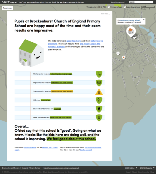
The question a parent actually asks isn’t “what is this school’s contextual value-added score?” — it’s “are the kids happy here, and is the teaching any good?” Schooloscope (known inside the studio as ‘Ashdown’) tried to answer that question, pulling together data from Ofsted, the Department for Education and Edubase into a single, friendly page for every school in England. It was built by BERG and funded by 4iP, Channel 4’s digital investment fund.
The honest part of this story is that the two people who did the heavy lifting weren’t me. This page exists to point at their work.
Toiling in the data mines
Most of BERG’s ‘material explorations’ were with tangible stuff. Here the raw material was the data — and you can’t design with a material you can’t yet feel. Tom Armitage did the material exploration: the patient, unglamorous work of getting deep into the datasets — what’s in them, what’s significant, what stories they want to tell — building throwaway models and quick visualisations until the rest of us could see what was there. It’s a brilliant, candid piece of writing about what data exploration actually feels like: the overwhelm, the overnight processing runs, the rhythm of coding bursts and waiting. The product only became designable once Tom had done that.
Humanising data
The other leap was Matt Brown’s.
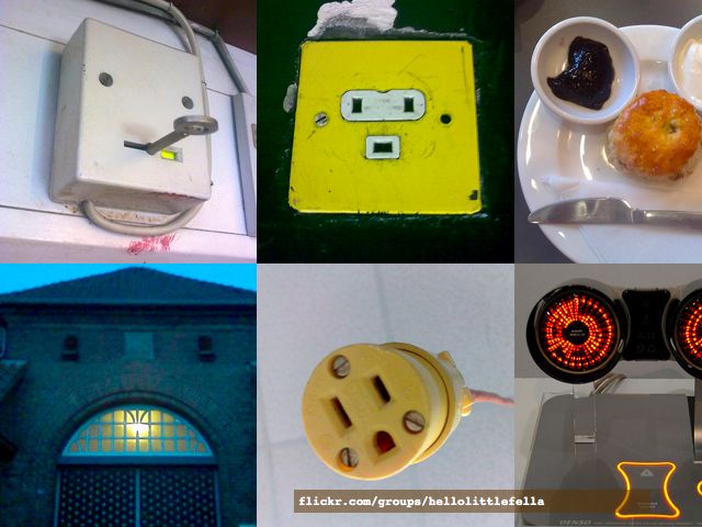
We’re wired to find faces everywhere — a quirk of perception called pareidolia. (I’d been collecting examples for years in a Flickr group called ‘Hello Little Fella’.) The brain’s fusiform face area lights up for a face-like pattern in about 165 milliseconds — faster than we can read a number.
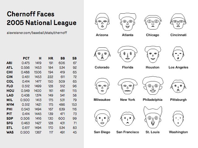
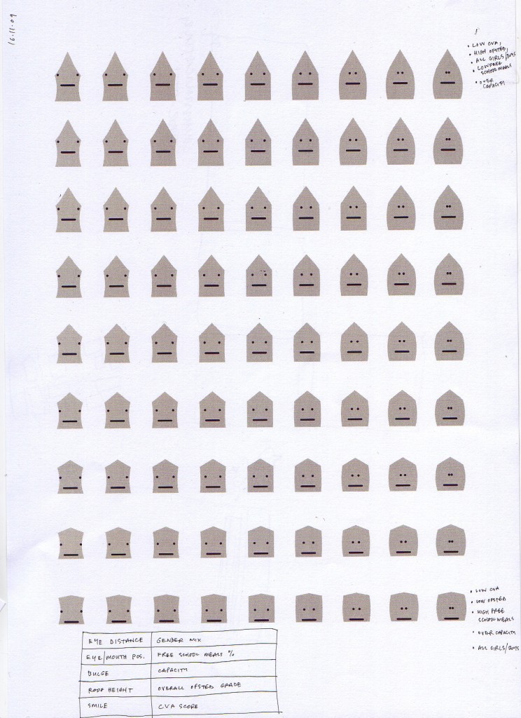
There’s a visualisation technique that exploits exactly this: Chernoff faces, invented by Hermann Chernoff in 1972, which map the variables in a row of data onto the features of a face, so patterns in many dimensions jump out at a glance.
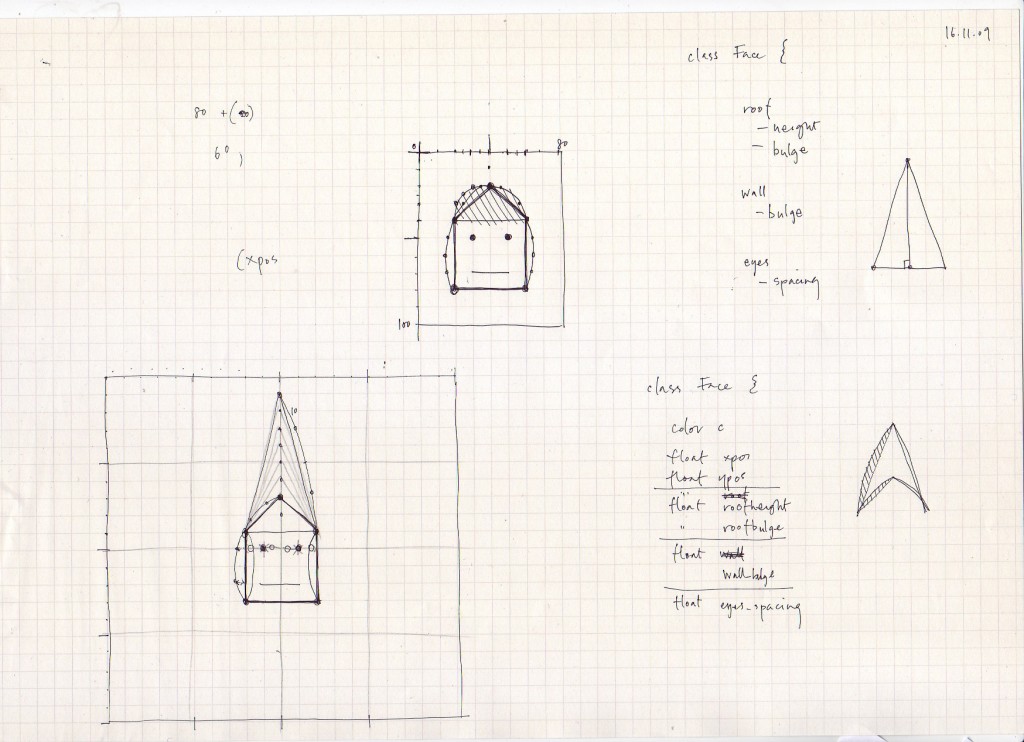
Matt took that idea and ran with it, designing ‘Chernoff Schools’: every school drawn as a little house with a face, its features driven by the data. He worked it out as code-on-paper first — a Face class whose roof height, wall bulge and eye-spacing were all variables.
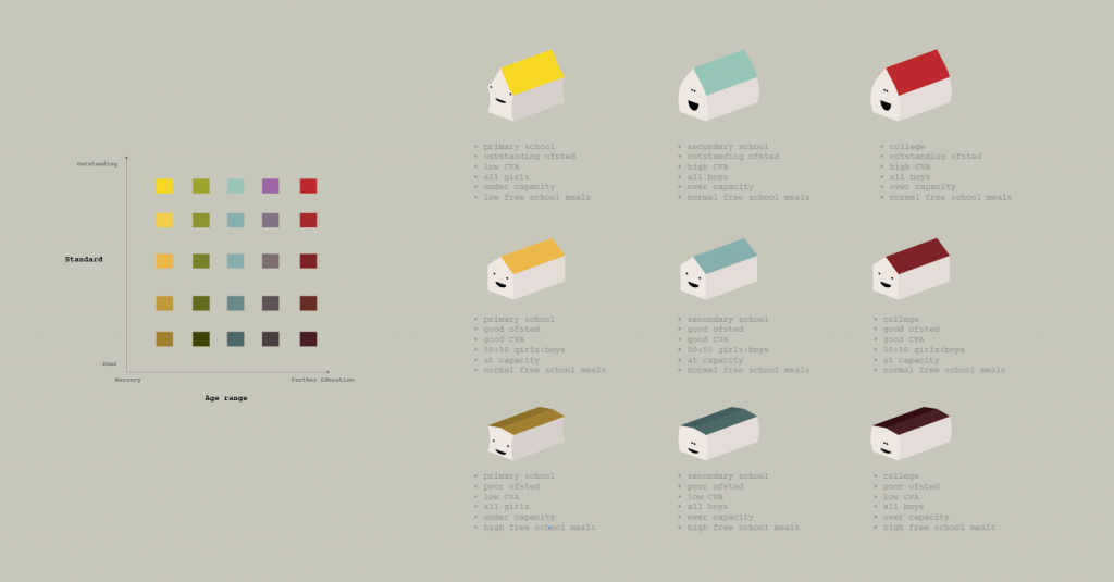
The faces did something a league table can’t: they let you scan a whole neighbourhood and feel the difference between places before reading a word.
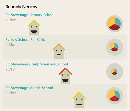
Over time the site shifted from being pretty-but-heavy information design towards something warmer: plain natural language, friendly faces, and a tone that treated parents as people rather than analysts.
Schooloscope launched in 2010 and ran until May 2012. The faces got the attention — but they only worked because of the brilliance behind them. Thank you, Tom and Matt.